Author

Dmitry Shemetov & David Weber

Published

May 22, 2025

Forecasting Season 2024/25 Summary

State level quantile forecasting of flu and covid hospitalizations


Dmitry Shemetov & David Weber

May 22, 2025

Major Forecasting Challenges

  • non-stationarity - varying vaccination rates, strains, mobility, superspreader events, etc.
  • large seasonal variation (flu) - season start, duration, and peak size vary
  • lack of seasonal component (covid) - seasonal pattern in the data is weak (post-pandemic)
  • bad data quality - initial observations are incomplete, regular reporting delays, errors, etc.
  • few seasons to train on - NHSN data starts in 2020, the first two seasons are excluded because they were anomalous due to the pandemic, so effectively only 2 seasons of data are available for training

The Data

Recent Seasons Data: Flu

nhsn_archive_flu <- qs2::qs_read(here::here("flu_hosp_prod", "objects", "nhsn_archive_data"))
nhsn_latest <- nhsn_archive_flu %>%
  epix_as_of_current() %>%
  # Cut out the tiny fraction of 2019/20 data (there's like 58 data points)
  filter(time_value >= "2020-10-01") %>%
  add_season_info() %>%
  filter(geo_value %nin% c("as", "gu", "mp", "vi"))
ggplot(nhsn_latest, aes(x = season_week, y = value, color = season, size = season)) +
  geom_line() +
  facet_wrap(~geo_value, scale = "free") +
  theme(legend.text = element_text(size = 12)) +
  scale_size_manual(values = c(rep(0.5,5), 1))

Here we see the 2024/25 season in pink. It’s the worst season in 15 years and very different from the previous 2 seasons. Before that, the 2020/21 and the 2021/22 seasons are essentially negligible due to the pandemic (so we’ve dropped them).

SciAm article with some speculation on why. - Late start -> less protection + 2nd wave - different strain (H3N2 H1N1) - decreased vaccination (not that low) - lower levels of immunity from decreased exposure

This bears out somewhat in NSSP, but it is not as extreme an increase, so it may be a change in reporting.

Recent Seasons Data: Covid

nhsn_archive_covid <- qs2::qs_read(here::here("covid_hosp_prod", "objects", "nhsn_archive_data"))
nhsn_latest_covid <- nhsn_archive_covid %>%
  epix_as_of_current() %>%
  add_season_info() %>%
  filter(geo_value %nin% c("as", "gu", "mp", "vi"), season %nin% c("2019/20", "2020/21", "2021/22"))
ggplot(nhsn_latest_covid, aes(x = season_week, y = value, color = season, size = season)) +
  geom_line() +
  facet_wrap(~geo_value, scale = "free") +
  theme(legend.text = element_text(size = 12)) +
  scale_size_manual(values = c(rep(0.5, 2), 1))

Here we’ve dropped the 2020 through 2022 seasons because they absolutely swamp the past 3 years. Even so, this year is frequently without a season at all depending on the geo (for instance, see CA and FL and TX); part of the reason for this is the late summer wave, which is not visible in this data.

Data Revisions: Flu

nhsn_archive_flu$time_type <- "day"
revision_sum <- nhsn_archive_flu %>% epiprocess::revision_analysis(value, min_waiting_period = NULL)
av_re_spread <- revision_sum$revision_behavior %>%
  group_by(geo_value) %>%
  summarize(rel_spread = mean(rel_spread, na.rm = TRUE)) %>%
  arrange(desc(rel_spread)) %>%
  filter(geo_value %nin% c("vi", "as", "gu"))
nhsn_filtered <- nhsn_archive_flu %>%
  filter(geo_value %in% av_re_spread$geo_value[1:18]) %>%
  filter(time_value >= "2024-11-19")
nhsn_filtered$DT %<>%
  mutate(geo_value = factor(geo_value, levels = av_re_spread$geo_value[1:18]))
autoplot(nhsn_filtered, "value") + facet_wrap(~geo_value, ncol = 3, scales = "free") + theme(strip.text.x = element_text(size = 8)) +
  labs(title = "States with the largest mean revision")

Here we see the revision behavior in the states with the largest mean revision. Note that some revisions are massive: NH, AZ, MN, MO.

Data Revisions: Covid

nhsn_archive_covid$time_type <- "day"
revision_sum <- nhsn_archive_covid %>% epiprocess::revision_analysis(value, min_waiting_period = NULL)
av_re_spread <- revision_sum$revision_behavior %>%
  group_by(geo_value) %>%
  summarize(rel_spread = mean(rel_spread, na.rm = TRUE)) %>%
  arrange(desc(rel_spread)) %>%
  filter(geo_value %nin% c("vi", "as", "gu"))
nhsn_filtered <- nhsn_archive_covid %>%
  filter(geo_value %in% av_re_spread$geo_value[1:18]) %>%
  filter(time_value >= "2024-11-19")
nhsn_filtered$DT %<>%
  mutate(geo_value = factor(geo_value, levels = av_re_spread$geo_value[1:18]))
autoplot(nhsn_filtered, "value") + facet_wrap(~geo_value, ncol = 3, scales = "free") + theme(strip.text.x = element_text(size = 8)) +
  labs(title = "States with the largest mean revision")

Here we see the revision behavior in the states with the largest mean revision. Note that some revisions are massive: DC, AZ, MN, MO, HI.

Models

Our Models: Simplest

In order of increasing complexity/usage

  • linear: linearly extrapolate the last 4 weeks
  • climate_base: a climatological model, quantiles estimated from a 7 week period centered on the target_date’s season week from historical data for that geo
  • climate_geo: a climatological model, like climate_base but converts to rates, and then creates quantiles using all geos.
  • climate_linear: a weighted ensemble of the climatological and linear
weights <-
  make_ahead_weights(-1:3) %>%
  left_join(
    make_quantile_weights(covidhub_probs()),
    by = c("forecast_family"),
    relationship = "many-to-many"
  ) %>%
  mutate(weight = weight.x * weight.y) %>%
  select(forecast_family, quantile, ahead, weight)
weights %>%
  filter(forecast_family == "climate") %>%
  ggplot(aes(y = factor(ahead), x = factor(quantile), fill = weight)) +
  geom_tile() +
  scale_fill_viridis_c(limits = c(0,1))

Our Models: Autoregressive

  • windowed_seasonal: an AR model where the training data is taken from a window 4 weeks before and after the training
    • The model is roughly xt=xt7+xt14, where x is the scaled NHSN data (along with ILI+ and FluSURV) and t is the target date in days.
    • Covid predicted this on rates data
    • For flu, this model also uses ILI+ data and fluSURV, with the forecasts done on variance-stabilized, scaled, and centered data, on a per-geo-source basis.
      • the variance stabilization is a 4th root
      • the scaling is by the difference between the 5th and 95th quantiles
      • the centering is so that the median is zero

This “training window” approach to handling seasonality gave a large improvement to the model score over the base AR model. The augmented data sources also improved the model score. We did not see much improvement from adding more lags or tweaking the whitening settings.

Our Models: Autoregressive with Exogenous Predictors

  • windowed_seasonal_nssp: like windowed_seasonal without the data scaling, and using nssp (emergency department visits) as an exogenous predictor (same lags).
    • The model is roughly xt=xt7+xt14+yt7+yt14, where x is the scaled NHSN data (along with ILI+ and FluSURV) and y is the NSSP data, and t is the target date in days.

This exogenous predictor gave the largest improvement to the model score out of Google Symptoms and NWSS.

Timeline of models used

Flu Model

  • 2024-11-21 initial forecast, straight average of climate_base, climate_geo and linear
  • 2024-11-27 climate_linear ensemble instead of average (2 weeks)
  • 2024-12-11 introduce windowed_seasonal to ensemble (5 weeks)
  • 2025-01-15 introduce windowed_seasonal_nssp to ensemble
  • Final model ensembles windowed_seasonal (which uses ILI+ and FluSURV), windowed_seasonal_nssp (which doesn’t), and climate_linear

Covid Model

  • 2024-11-21 initial forecast, straight average of climate_base, climate_geo and linear
  • 2024-11-27 climate_linear ensemble instead of average (9 weeks)
  • 2025-01-29 windowed_seasonal_nssp introduced to ensemble
  • 2025-02-19 forecast using only windowed_seasonal_nssp
  • Final model uses only windowed_seasonal_nssp, except for states without nssp, where it ensembles windowed_seasonal and climate_linear

The takeaway here is mostly that we changed the model a lot as the season progressed.

Flu Scores

Flu Scores: WIS

flu_archive <- qs2::qs_read(here::here("flu_hosp_prod", "objects", "nhsn_archive_data"))
flu_current <- flu_archive %>%
  epix_as_of_current() %>%
  filter(geo_value %nin% c("as", "gu", "mp", "vi"))
flu_max <- flu_current %>% group_by(geo_value) %>% summarize(max_value = max(value))
compute_peak_season <- function(data_current, threshold = 0.5, start_of_year = as.Date("2024-11-01")) {
  season_length <- data_current %>% pull(time_value) %>% max() - start_of_year
  data_current %>%
    filter(time_value > start_of_year) %>%
    group_by(geo_value) %>%
    mutate(max_val = max(value)) %>%
    filter(value >= threshold * max_val) %>%
    summarize(first_above = min(time_value), last_above = max(time_value)) %>%
    mutate(
      duration = last_above - first_above,
      rel_duration = as.integer(duration) / as.integer(season_length))
}
classify_phase <- function(time_value, first_above, last_above, rel_duration, threshold) {
  case_when(
    rel_duration > threshold ~ "flat",
    time_value < first_above ~ "increasing",
    time_value > last_above ~ "decreasing",
    .default = "peak"
  ) %>% factor(levels = c("increasing", "peak", "decreasing", "flat"))
}
flu_flat_threshold <- 0.9
flu_within_max <- compute_peak_season(flu_current)

sanity_check_classifying <- flu_current %>%
  left_join(flu_within_max, by = "geo_value") %>%
  mutate(phase = classify_phase(time_value, first_above, last_above, rel_duration, flu_flat_threshold)) %>%
  group_by(geo_value) %>%
  distinct(phase)
repo_forecasters <- c(setdiff(unique(flu_scores$forecaster), our_forecasters), "CMU-TimeSeries")
flu_score_summary <- flu_scores %>%
  left_join(state_census, by = join_by(geo_value == abbr)) %>%
  group_by(forecaster) %>%
  mutate(
    min_wis = min(wis[wis > 1e-5]),
    min_ae = min(ae_median[ae_median > 1e-5])
  ) %>%
  summarize(
    mean_wis = round(Mean(wis), 2),
    wis_sd = round(sd(wis), 2),
    pop_norm_wis = round(Mean(wis *1e5/pop), 2),
    pop_norm_wis_sd = round(sd(wis * 1e5/pop), 2),
    geo_wis = round(GeoMean(wis, min_wis), 2),
    #nWISzero = sum(wis < 1e-5),
    mean_ae = round(Mean(ae_median), 2),
    ae_sd = round(sd(ae_median), 2),
    pop_norm_ae = round(Mean(ae_median*1e5/pop), 2),
    pop_norm_ae_sd = round(sd(ae_median * 1e5/pop), 2),
    geo_ae = round(GeoMean(ae_median, min_ae), 2),
    #nAEzero = sum(ae_median < 1e-5),
    mean_cov_50 = round(Mean(interval_coverage_50), 2),
    mean_cov_90 = round(Mean(interval_coverage_90), 2),
    n = n()
  ) %>%
  arrange(mean_wis)

The external forecasters are in bold. Our submitted forecasts are “CMU-TimeSeries”. The rest are our component models (as they exist now).

Takeaways: - windowed_seasonal_nssp attains very low WIS - climate_linear performs surprisingly well given its simplicity - TODO: more commentary

Flu Scores: Absolute Error

flu_ae_summary <- flu_score_summary %>%
  arrange(mean_ae) %>%
  filter(forecaster %nin% c("seasonal_nssp_latest")) %>%
  select(forecaster, mean_ae, ae_sd, pop_norm_ae, pop_norm_ae_sd, mean_cov_50, mean_cov_90, n) %>%
  arrange(mean_ae)
datatable(
    flu_ae_summary,
    fillContainer = FALSE,
    options = list(
      initComplete = htmlwidgets::JS(
          "function(settings, json) {",
          paste0("$(this.api().table().container()).css({'font-size': '", "10pt", "'});"),
          "}"),
      pageLength = 25
    )
  ) %>%
  formatStyle("forecaster", target = c("cell"),
              fontWeight = styleEqual(repo_forecasters, rep("900", length(repo_forecasters))),
              textDecoration = styleEqual("CMU-TimeSeries", "underline")) %>%
  formatStyle(
    "mean_ae",
    background = styleColorBar(c(0, max(flu_ae_summary$mean_ae)), 'lightblue'),
    backgroundSize = '98% 88%',
    backgroundRepeat = 'no-repeat',
    backgroundPosition = 'center'
  ) %>%
  formatStyle(
    "pop_norm_ae",
    background = styleColorBar(c(0, max(flu_ae_summary$pop_norm_ae)), 'lightblue'),
    backgroundSize = '98% 88%',
    backgroundRepeat = 'no-repeat',
    backgroundPosition = 'center'
  )

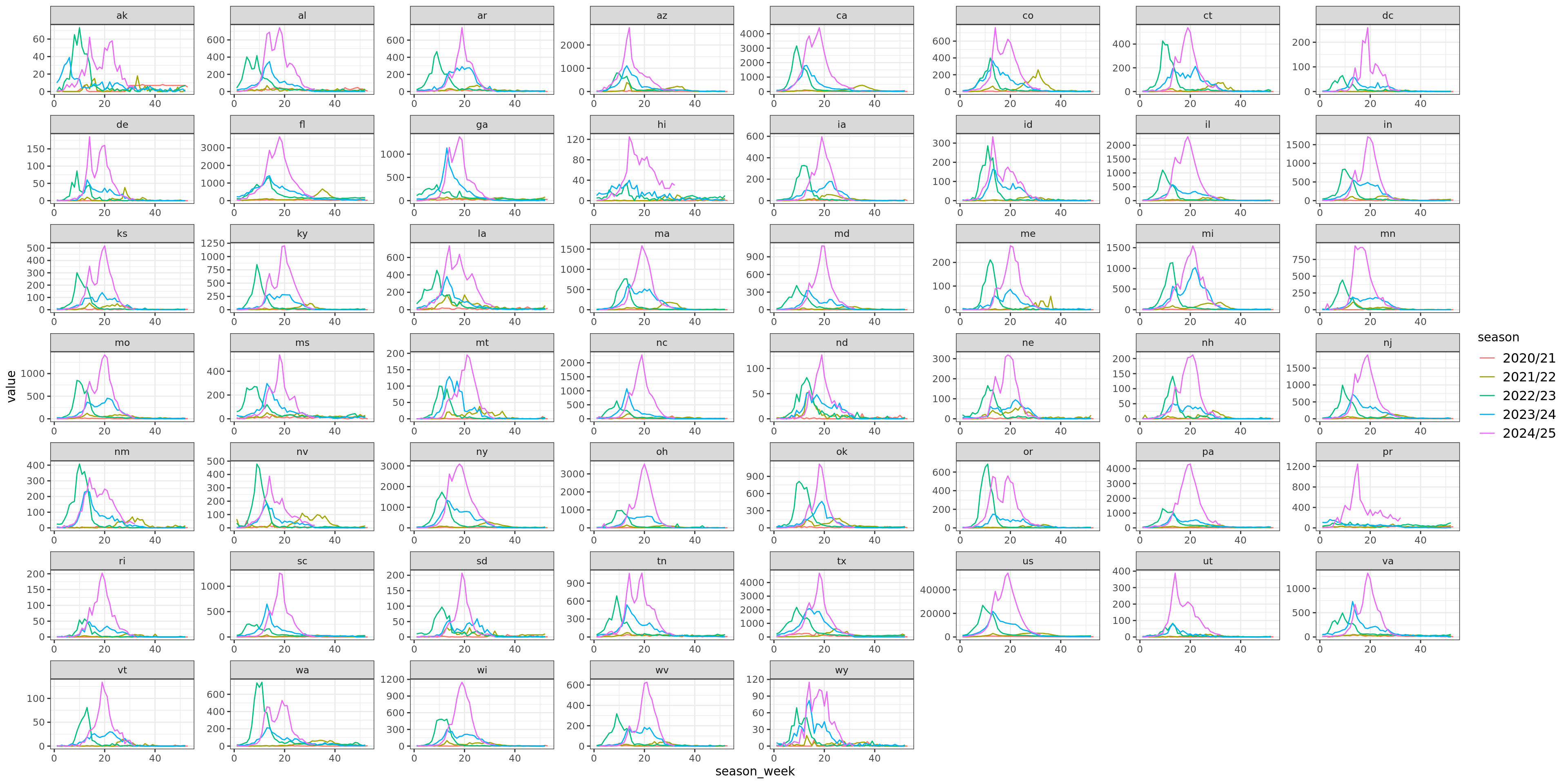
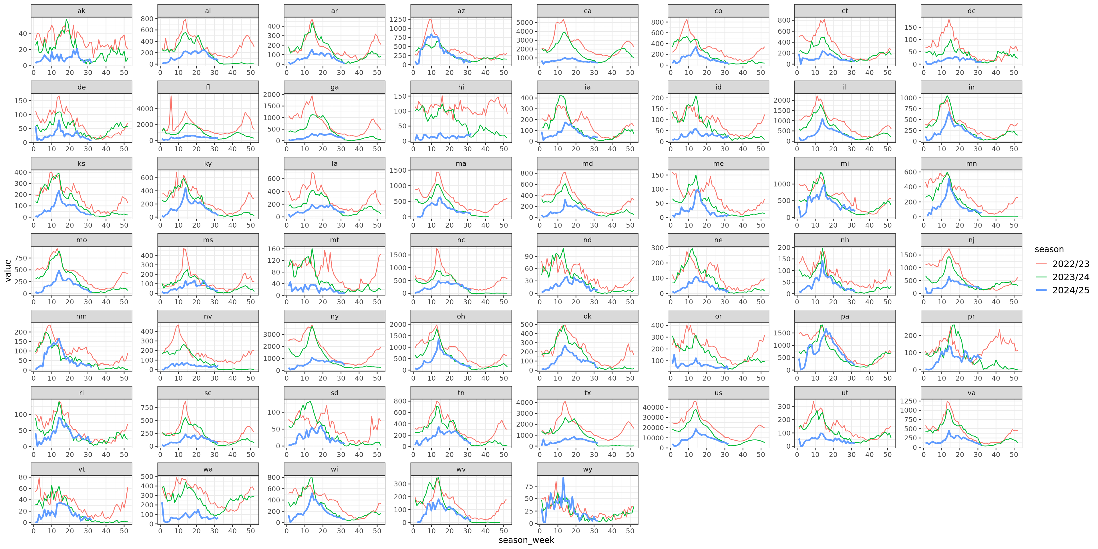
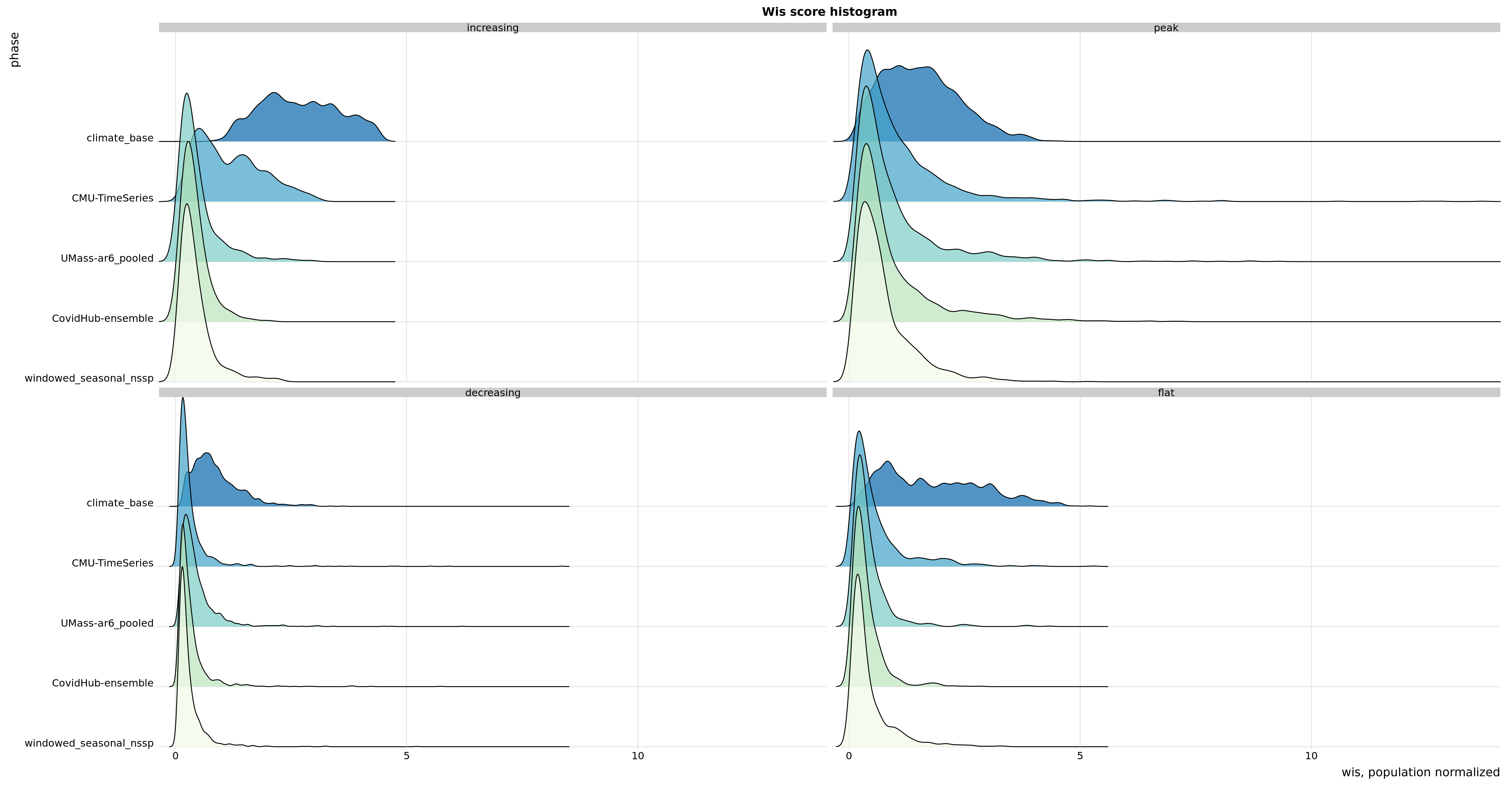
Flu Scores: WIS Rate Histogram

These scores are rates rather than counts, and color gives population. Note there’s an implied fat tail in the distribution of scores. Overall, the distributions of scores are very similar.

In the increasing phase, CMU-TimeSeries has a smaller left tail, but a more concentrated middle, and smaller right tail, so this doesn’t show up in the aggregate. In the peak phase, CMU-TimeSeries has a thinner left tail (meaning we have fewer cases where we’re dead on), which is enough to show up in the aggregate. The decreasing phase is about the same for the compared models.

ggplot(data, aes(x = wis, y = forecaster, fill = forecaster)) + geom_density_ridges(scale = 3, alpha = 0.7) + scale_y_discrete(expand = c(0, 0)) + # will generally have to set the expand option scale_x_continuous(expand = c(0, 0)) + # for both axes to remove unneeded padding scale_fill_brewer(palette = 4) + coord_cartesian(clip = “off”) + # to avoid clipping of the very top of the top ridgeline theme_ridges() + facet_wrap(~phase) + labs(title = “Wis score histogram”) + ylab(“phase”) + xlab(“wis, population normalized”) + theme(plot.title = element_text(hjust = 0.5), legend.position = “none”) + theme(legend.position = “none”)


## Flu Scores: Phase
::: {.notes}
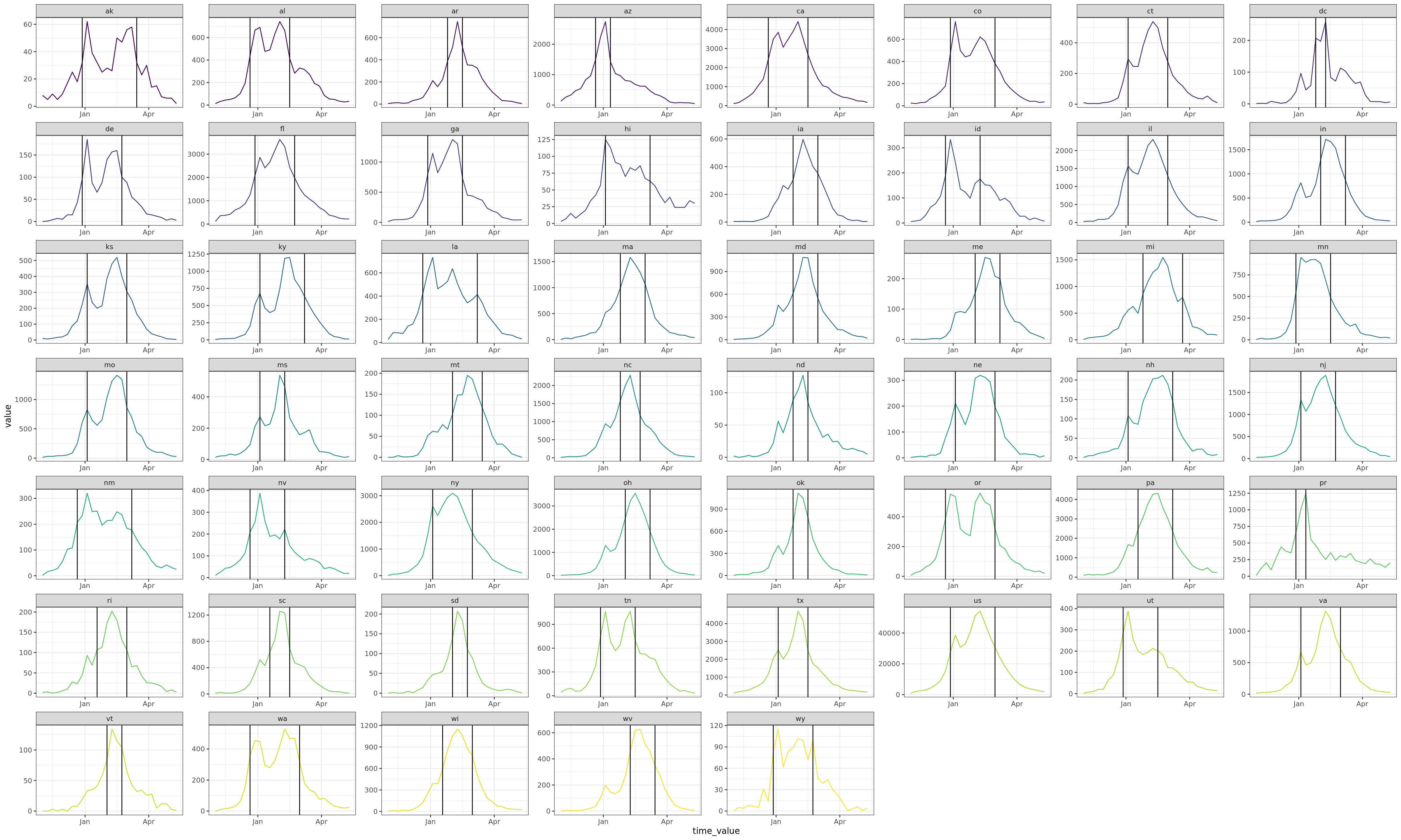
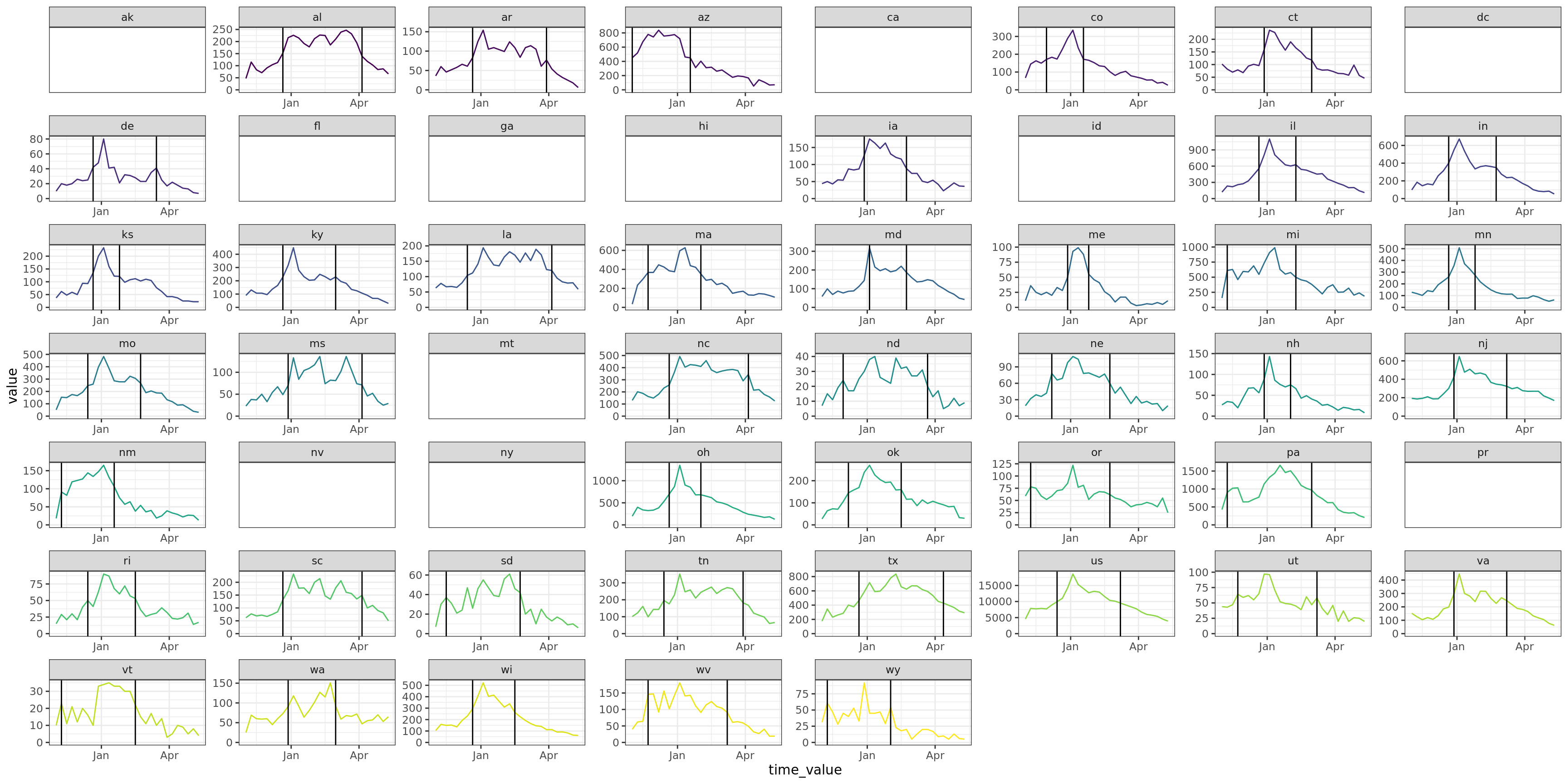
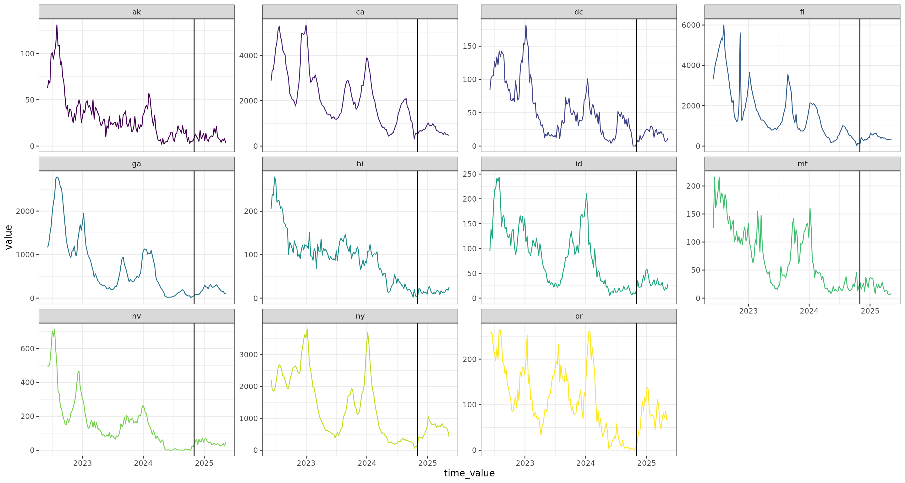
We classify the season into three phases: increasing, peak, and decreasing.
Increasing is before the first time the value exceeds a threshold.
Decreasing is the last time the value dips below the threshold.
Peak is between these two.
The threshold is chosen at 50% of the max value.

Note that our WIS/AE is in the top 5, but everyone's score is quite similar and washed out.
We performed well in the increasing/decreasing phases, but most of our error came in the peak phase.
:::


::: {.cell layout-align="center"}

```{.r .cell-code}
phase_scores <-
  flu_scores %>%
  filter(forecaster %nin% c("seasonal_nssp_latest")) %>%
  left_join(flu_within_max, by = "geo_value") %>%
  mutate(phase = classify_phase(target_end_date, first_above, last_above, rel_duration, flu_flat_threshold)) %>%
  group_by(forecaster, phase) %>%
  summarize(
    wis_sd = round(sd(wis, na.rm = TRUE), 2),
    ae_sd = round(sd(ae_median, na.rm = TRUE), 2),
    across(c(wis, ae_median, interval_coverage_90), \(x) round(Mean(x), 2)),
    n = n(),
    our_forecaster = first(our_forecaster),
    .groups = "drop"
  )
sketch <- htmltools::withTags(table(
  class = 'display',
  style = "font-size: 11px;",
  thead(
    tr(
      th(colspan = 2, "forecaster"),
      th(colspan = 2, 'increasing'),
      th(colspan = 2, 'peak'),
      th(colspan = 2, 'decreasing')
    ),
    tr(
      list(th("peak_wis_rank"), th("name"),
           lapply(rep(c('wis', 'sd'), 3), th)
           )
    )
  )
))
phase_scores_wider <- phase_scores %>%
  select(forecaster, phase, wis, wis_sd, our_forecaster) %>%
  pivot_wider(names_from = phase, values_from = c(wis, wis_sd))
wis_max <- phase_scores_wider %>% select(wis_increasing, wis_peak, wis_decreasing) %>% max()
phase_scores_wider %>%
  select(forecaster, wis_increasing, wis_sd_increasing, wis_peak, wis_sd_peak, wis_decreasing, wis_sd_decreasing) %>%
  arrange(wis_peak) %>%
  datatable(
    fillContainer = FALSE,
    options = list(
      initComplete = htmlwidgets::JS(
          "function(settings, json) {",
          paste0("$(this.api().table().container()).css({'font-size': '", "11pt", "'});"),
          "}"),
      pageLength = 25
    ),
    container = sketch
  ) %>%
  formatStyle("forecaster", target = c("cell"),
              fontWeight = styleEqual(repo_forecasters, rep("900", length(repo_forecasters))),
              textDecoration = styleEqual("CMU-TimeSeries", "underline")) %>%
  formatStyle(
    "wis_increasing",
    background = styleColorBar(c(0, wis_max), 'lightblue'),
    backgroundSize = '98% 88%',
    backgroundRepeat = 'no-repeat',
    backgroundPosition = 'center'
  ) %>%
  formatStyle(
    "wis_peak",
    background = styleColorBar(c(0, wis_max), 'lightblue'),
    backgroundSize = '98% 88%',
    backgroundRepeat = 'no-repeat',
    backgroundPosition = 'center'
  ) %>%
  formatStyle(
    "wis_decreasing",
    background = styleColorBar(c(0, wis_max), 'lightblue'),
    backgroundSize = '98% 88%',
    backgroundRepeat = 'no-repeat',
    backgroundPosition = 'center'
  )

:::

Flu: Sample Forecasts

80% CI We’re plotting the 80% CI along with the median. The locations were chosen based on the scores to have a sample of large and small states with large and small (population normalized) WIS. We’ve scaled so everything is in rates per 100k so that it’s easier to actually compare; even so the peak value varies drastically. Forecasters we’ve produced are blue, while forecasters from other teams are red. They are ordered by mean_wis score, best to worst.

Flu: Forecasting on latest

The point is to demonstrate the upper bound of what accurate nowcasting would get us. named seasonal_nssp_latest compare with windowed_seasonal_nssp. Generally outperforms all other models by a good margin.

phase_scores <-
  flu_scores %>%
  left_join(flu_within_max, by = "geo_value") %>%
  mutate(phase = classify_phase(target_end_date, first_above, last_above, rel_duration, flu_flat_threshold)) %>%
  group_by(forecaster, phase) %>%
  summarize(
    wis_sd = round(sd(wis, na.rm = TRUE), 2),
    ae_sd = round(sd(ae_median, na.rm = TRUE), 2),
    across(c(wis, ae_median, interval_coverage_90), \(x) round(Mean(x), 2)),
    n = n(),
    our_forecaster = first(our_forecaster),
    .groups = "drop"
  )
sketch <- htmltools::withTags(table(
  class = 'display',
  style = "font-size: 11px;",
  thead(
    tr(
      th(colspan = 2, "forecaster"),
      th(colspan = 2, 'increasing'),
      th(colspan = 2, 'peak'),
      th(colspan = 2, 'decreasing')
    ),
    tr(
      list(th("peak_wis_rank"), th("name"),
           lapply(rep(c('wis', 'sd'), 3), th)
           )
    )
  )
))
phase_scores_wider <- phase_scores %>%
  select(forecaster, phase, wis, wis_sd, our_forecaster) %>%
  pivot_wider(names_from = phase, values_from = c(wis, wis_sd))
wis_max <- phase_scores_wider %>% select(wis_increasing, wis_peak, wis_decreasing) %>% max()
phase_scores_wider %>%
  select(forecaster, wis_increasing, wis_sd_increasing, wis_peak, wis_sd_peak, wis_decreasing, wis_sd_decreasing) %>%
  arrange(wis_peak) %>%
  datatable(
    fillContainer = FALSE,
    options = list(
      initComplete = htmlwidgets::JS(
          "function(settings, json) {",
          paste0("$(this.api().table().container()).css({'font-size': '", "11pt", "'});"),
          "}"),
      pageLength = 25
    ),
    container = sketch
  ) %>%
  formatStyle("forecaster", target = c("cell"),
              fontWeight = styleEqual(repo_forecasters, rep("900", length(repo_forecasters))),
              textDecoration = styleEqual("CMU-TimeSeries", "underline")) %>%
  formatStyle(
    "wis_increasing",
    background = styleColorBar(c(0, wis_max), 'lightblue'),
    backgroundSize = '98% 88%',
    backgroundRepeat = 'no-repeat',
    backgroundPosition = 'center'
  ) %>%
  formatStyle(
    "wis_peak",
    background = styleColorBar(c(0, wis_max), 'lightblue'),
    backgroundSize = '98% 88%',
    backgroundRepeat = 'no-repeat',
    backgroundPosition = 'center'
  ) %>%
  formatStyle(
    "wis_decreasing",
    background = styleColorBar(c(0, wis_max), 'lightblue'),
    backgroundSize = '98% 88%',
    backgroundRepeat = 'no-repeat',
    backgroundPosition = 'center'
  )

Covid Scores

Covid Scores: WIS

CMU-TimeSeries did significantly worse; a large part of this is poor performance on literally the first week

covid_archive <- qs2::qs_read(here::here("covid_hosp_prod", "objects", "nhsn_archive_data"))
covid_current <- covid_archive %>%
  epix_as_of_current() %>%
  filter(geo_value %nin% c("as", "gu", "mp", "vi"))
covid_max <- covid_current %>% group_by(geo_value) %>% summarize(max_value = max(value))
covid_within_max <- compute_peak_season(covid_current)

covid_flat_threshold <- 0.6
sanity_check_classifying <- covid_current %>%
  left_join(covid_within_max, by = "geo_value") %>%
  mutate(phase = classify_phase(time_value, first_above, last_above, rel_duration, covid_flat_threshold)) %>%
  group_by(geo_value) %>%
  distinct(phase)

repo_forecasters <- c(setdiff(unique(covid_scores$forecaster), our_forecasters), "CMU-TimeSeries")
covid_score_summary <- covid_scores %>%
  left_join(state_census, by = join_by(geo_value == abbr)) %>%
  group_by(forecaster) %>%
  mutate(
    min_wis = min(wis[wis > 1e-5]),
    min_ae = min(ae_median[ae_median > 1e-5])
  ) %>%
  summarize(
    mean_wis = round(Mean(wis), 2),
    wis_sd = round(sd(wis), 2),
    pop_norm_wis = round(Mean(wis *1e5/pop), 2),
    pop_norm_wis_sd = round(sd(wis * 1e5/pop), 2),
    geo_wis = round(GeoMean(wis, min_wis), 2),
    #nWISzero = sum(wis < 1e-5),
    mean_ae = round(Mean(ae_median), 2),
    ae_sd = round(sd(ae_median), 2),
    pop_norm_ae = round(Mean(ae_median*1e5/pop), 2),
    pop_norm_ae_sd = round(sd(ae_median * 1e5/pop), 2),
    geo_ae = round(GeoMean(ae_median, min_ae), 2),
    #nAEzero = sum(ae_median < 1e-5),
    mean_cov_50 = round(Mean(interval_coverage_50), 2),
    mean_cov_90 = round(Mean(interval_coverage_90), 2),
    n = n()
  ) %>%
  arrange(mean_wis)

Covid Scores: Absolute Error

covid_ae_summary <- covid_score_summary %>%
  arrange(mean_ae) %>%
  filter(forecaster %nin% c("seasonal_nssp_latest")) %>%
  select(forecaster, mean_ae, ae_sd, pop_norm_ae, pop_norm_ae_sd, mean_cov_50, mean_cov_90, n)
  datatable(
    covid_ae_summary,
    fillContainer = FALSE,
    options = list(
      initComplete = htmlwidgets::JS(
          "function(settings, json) {",
          paste0("$(this.api().table().container()).css({'font-size': '", "10pt", "'});"),
          "}"),
      pageLength = 25
    )
  ) %>%
  formatStyle("forecaster", target = c("cell"),
              fontWeight = styleEqual(repo_forecasters, rep("900", length(repo_forecasters))),
              textDecoration = styleEqual("CMU-TimeSeries", "underline")) %>%
  formatStyle(
    "mean_ae",
    background = styleColorBar(c(0, max(covid_ae_summary$mean_ae)), 'lightblue'),
    backgroundSize = '98% 88%',
    backgroundRepeat = 'no-repeat',
    backgroundPosition = 'center'
  ) %>%
  formatStyle(
    "pop_norm_ae",
    background = styleColorBar(c(0, max(covid_ae_summary$pop_norm_ae)), 'lightblue'),
    backgroundSize = '98% 88%',
    backgroundRepeat = 'no-repeat',
    backgroundPosition = 'center'
  )

Coivd Scores: Aggregated By Forecast Date

DecJanFebMarApr50100150
forecasterCEPH-Rtrend_covidclimate_baseclimate_geo_aggedclimate_linearCMU-TimeSeriesCovidHub-baselineCovidHub-ensembleensemble_mixensemble_windowedlinearseasonal_nssp_latestUMass-ar6_pooledUMass-gbqrwindowed_seasonalwindowed_seasonal_nsspForecast DateMean WIS

Covid Scores: Wis Rate Histogram

These scores are rates rather than counts.

Note that again, the score distributions are very similar. You can see where CMU-TimeSeries performed worse at the beginning of the season in the top left. This was due to a naive use of the climatological baseline, which completely overestimated values in states that had no season.

Covid Scores: Phase

phase_scores <-
  covid_scores %>%
  filter(forecaster %nin% c("seasonal_nssp_latest")) %>%
  left_join(covid_within_max, by = "geo_value") %>%
  mutate(phase = classify_phase(target_end_date, first_above, last_above, rel_duration, covid_flat_threshold)) %>%
  group_by(forecaster, phase) %>%
  summarize(
    wis_sd = round(sd(wis, na.rm = TRUE), 2),
    ae_sd = round(sd(ae_median, na.rm = TRUE), 2),
    across(c(wis, ae_median, interval_coverage_90), \(x) round(Mean(x), 2)),
    n = n(),
    our_forecaster = first(our_forecaster),
    .groups = "drop"
  )
sketch <- htmltools::withTags(table(
  class = 'display',
  style = "font-size: 12px;",
  thead(
    tr(
      th(colspan = 2, "forecaster"),
      th(colspan = 2, 'increasing'),
      th(colspan = 2, 'peak'),
      th(colspan = 2, 'decreasing'),
      th(colspan = 2, 'flat')
    ),
    tr(
      list(th("peak_wis_rank"), th("name"),
           lapply(rep(c('wis', 'sd'), 4), th)
           )
    )
  )
))
phase_scores_wider <- phase_scores %>%
  select(forecaster, phase, wis, wis_sd, our_forecaster) %>%
  pivot_wider(names_from = phase, values_from = c(wis, wis_sd)) %>%
  select(forecaster, wis_increasing, wis_sd_increasing, wis_peak, wis_sd_peak, wis_decreasing, wis_sd_decreasing, wis_flat, wis_sd_flat) %>%
  arrange(wis_peak)
wis_max <- phase_scores_wider %>% select(wis_increasing, wis_peak, wis_decreasing) %>% max()
datatable(
  phase_scores_wider,
  fillContainer = FALSE,
  options = list(
    initComplete = htmlwidgets::JS(
          "function(settings, json) {",
          paste0("$(this.api().table().container()).css({'font-size': '", "12pt", "'});"),
          "}"),
    pageLength = 25
  ),
  container = sketch
) %>%
  formatStyle("forecaster", target = c("cell"),
              fontWeight = styleEqual(repo_forecasters, rep("900", length(repo_forecasters))),
              textDecoration = styleEqual("CMU-TimeSeries", "underline")) %>%
  formatStyle(
    "wis_increasing",
    background = styleColorBar(c(0, wis_max), 'lightblue'),
    backgroundSize = '98% 88%',
    backgroundRepeat = 'no-repeat',
    backgroundPosition = 'center'
  ) %>%
  formatStyle(
    "wis_peak",
    background = styleColorBar(c(0, wis_max), 'lightblue'),
    backgroundSize = '98% 88%',
    backgroundRepeat = 'no-repeat',
    backgroundPosition = 'center'
  ) %>%
  formatStyle(
    "wis_decreasing",
    background = styleColorBar(c(0, wis_max), 'lightblue'),
    backgroundSize = '98% 88%',
    backgroundRepeat = 'no-repeat',
    backgroundPosition = 'center'
  ) %>%
  formatStyle(
    "wis_flat",
    background = styleColorBar(c(0, wis_max), 'lightblue'),
    backgroundSize = '98% 88%',
    backgroundRepeat = 'no-repeat',
    backgroundPosition = 'center'
  )

Covid: Sample Forecasts

80% CI We’re plotting the 80% CI along with the median. The locations were chosen based on the scores to have a sample of large and small states with large and small (population normalized) WIS. We’ve scaled so everything is in rates per 100k so that it’s easier to actually compare; even so the peak value varies drastically. Forecasters we’ve produced are blue, while forecasters from other teams are red. They are ordered by mean_wis score, best to worst.

01234567891011121314150123456789101112131415161701234567891011121314151617181920NovDecJanFebMarAprMay01234567891011121314151617NovDecJanFebMarAprMayNovDecJanFebMarAprMayNovDecJanFebMarAprMayNovDecJanFebMarAprMay
target_end_dateratescadchipatxwindowed_seasonal_nsspCovidHub-ensembleUMass-ar6_pooledCMU-TimeSeries

Future Work

  • Account for “always decreasing” behavior observed in nearly all forecasters (include external forecasters)
    • We’ve determined that this is due to data bias, so we need ways to mitigate that.
    • Possible solution is to attempt to split the data into phase components and fit a different model to each phase. (Was tried before, but didn’t work as well as hoped; perhaps with a better phase definition it could be better?)
  • Nowcasting, revision anticipation
  • Forecasting at the city/county level for NSSP (metrocasting)
  • Check evaluation robustness via data “fuzzing”
    • A way to mitigate over-weighting the performance of a forecaster on a single season
    • Possibilities include parametric boot with observational noise (additive and/or shifts) or leave-one-out training across seasons (e.g. leave 2023 out and train on 2022 and 2024)

Covid: Forecasting on latest

The point is to demonstrate the upper bound of what accurate nowcasting would get us. named seasonal_nssp_latest compare with windowed_seasonal_nssp. Generally outperforms all other models by a good margin.

phase_scores <-
  covid_scores %>% 
  left_join(covid_within_max, by = "geo_value") %>%
  mutate(phase = classify_phase(target_end_date, first_above, last_above, rel_duration, covid_flat_threshold)) %>%
  group_by(forecaster, phase) %>%
  summarize(
    wis_sd = round(sd(wis, na.rm = TRUE), 2),
    ae_sd = round(sd(ae_median, na.rm = TRUE), 2),
    across(c(wis, ae_median, interval_coverage_90), \(x) round(Mean(x), 2)),
    n = n(),
    our_forecaster = first(our_forecaster),
    .groups = "drop"
  )

sketch <- htmltools::withTags(table(
  class = 'display',
  style = "font-size: 11px;",
  thead(
    tr(
      th(colspan = 2, "forecaster"),
      th(colspan = 2, 'increasing'),
      th(colspan = 2, 'peak'),
      th(colspan = 2, 'decreasing')
    ),
    tr(
      list(th("peak_wis_rank"), th("name"),
           lapply(rep(c('wis', 'sd'), 3), th)
           )
    )
  )
))

phase_scores_wider <- phase_scores %>%
  select(forecaster, phase, wis, wis_sd, our_forecaster) %>%
  pivot_wider(names_from = phase, values_from = c(wis, wis_sd))

wis_max <- phase_scores_wider %>% select(wis_increasing, wis_peak, wis_decreasing) %>% max()

phase_scores_wider %>%
  select(forecaster, wis_increasing, wis_sd_increasing, wis_peak, wis_sd_peak, wis_decreasing, wis_sd_decreasing) %>%
  arrange(wis_peak) %>%
  datatable(
    fillContainer = FALSE,
    options = list(
      initComplete = htmlwidgets::JS(
          "function(settings, json) {",
          paste0("$(this.api().table().container()).css({'font-size': '", "11pt", "'});"),
          "}"),
      pageLength = 25
    ),
    container = sketch
  ) %>%
  formatStyle("forecaster", target = c("cell"),
              fontWeight = styleEqual(repo_forecasters, rep("900", length(repo_forecasters))),
              textDecoration = styleEqual("CMU-TimeSeries", "underline")) %>%
  formatStyle(
    "wis_increasing",
    background = styleColorBar(c(0, wis_max), 'lightblue'),
    backgroundSize = '98% 88%',
    backgroundRepeat = 'no-repeat',
    backgroundPosition = 'center'
  ) %>%
  formatStyle(
    "wis_peak",
    background = styleColorBar(c(0, wis_max), 'lightblue'),
    backgroundSize = '98% 88%',
    backgroundRepeat = 'no-repeat',
    backgroundPosition = 'center'
  ) %>%
  formatStyle(
    "wis_decreasing",
    background = styleColorBar(c(0, wis_max), 'lightblue'),
    backgroundSize = '98% 88%',
    backgroundRepeat = 'no-repeat',
    backgroundPosition = 'center'
  )

Final slide

Thanks:

  • The whole CMU Delphi Team (across many institutions)
  • Optum/UnitedHealthcare, Change Healthcare.
  • Google, Facebook, Amazon Web Services.
  • Quidel, SafeGraph, Qualtrics.
  • Centers for Disease Control and Prevention.
  • Council of State and Territorial Epidemiologists

Appendix

Scoring Metrics

  • Weighted interval score (WIS)
    • Discrete approximation to CRPS, which sums the colored area in the figure squared
  • Absolute error (AE)
    • |ytm| where m is the median forecast
  • 80% prediction interval coverage (80%PI)
    • Proportion of times the true value falls within the center 80%
df <- data.frame(x = seq(-1, 2, length.out = 3000))

# Calculate y values for both functions
df$y1 <- pnorm(df$x, mean = 0.5, sd = 0.25)  # Normal CDF
df$y2 <- ifelse(df$x >= 0.75, 1, 0)        # Step function

# Plot
ggplot(df, aes(x = x)) +
  # Plot the functions with color aesthetic
  geom_line(aes(y = y1, color = "CDF of forecast")) +
  geom_line(aes(y = y2, color = "Eventually observed value")) +
  # Add the ribbon between the functions
  geom_ribbon(aes(ymin = pmin(y1, y2), ymax = pmax(y1, y2), fill = "WIS ~ ∫(F(x) - I(x ≥ .75))²"),
              alpha = 0.3) +
  # Customize colors and fills
  scale_color_manual(name = "", values = c("CDF of forecast" = "red",
                                          "Eventually observed value" = "blue")) +
  scale_fill_manual(name = "", values = c("WIS ~ ∫(F(x) - I(x ≥ .75))²" = "red")) +
  # Add legend inside plot
  theme(legend.position = c(0.2, 0.8),  # Adjust these values to position the legend
        legend.background = element_rect(fill = "white"),
        legend.text = element_text(size = 6)) +
  labs(x = "x", y = "CDF", title = "WIS example") +
  theme(plot.title = element_text(hjust = 0.5))

Explicit phase definitions: Flu

flu_current %>%
  filter(time_value > "2024-11-01") %>%
  autoplot(value, .facet_by = "geo_value") +
  geom_vline(data = flu_within_max, aes(xintercept = first_above)) +
  geom_vline(data = flu_within_max, aes(xintercept = last_above)) +
  facet_wrap(~geo_value, scale = "free") +
  theme(legend.position = "none")

Explicit phase definitions: Covid

no_phase <- covid_within_max %>% arrange(desc(rel_duration)) %>% filter(rel_duration > covid_flat_threshold)
covid_current %>%
  filter(time_value > "2024-11-01", geo_value %nin% no_phase$geo_value) %>%
  autoplot(value, .facet_by = "geo_value") +
  geom_vline(data = covid_within_max, aes(xintercept = first_above)) +
  geom_vline(data = covid_within_max, aes(xintercept = last_above)) +
  facet_wrap(~geo_value, scale = "free") +
  ylim(0, NA) +
  theme(legend.position = "none")

Explicit phase definitions: Covid flat

covid_current %>%
  filter(time_value > "2022-06-01") %>%
  filter(geo_value %in% no_phase$geo_value) %>%
  autoplot(value, .facet_by = "geo_value") +
  geom_vline(aes(xintercept = as.Date("2024-11-01"))) +
  ylim(0, NA) +
  theme(legend.position = "none")